

Project: ShopStatus
Bowtie is a Denver based design & development agency started by Chad Person and Charlie McClung. They recognized a need for clients who are Shopify store owners.
Shopify is an e-commerce platform for online stores and retail point-of-sale systems. Chad and Charlie developed a supplementary webapp called ShopStatus. ShopStatus acts as a Shopify store monitor to alert owners so that they can more quickly resolve an issue and save time and money.
Client: Bowtie
Role: UX/UI Designer
First Client Meeting
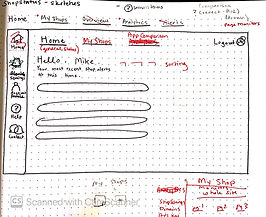
To prep for our first client meeting with Bowtie, we gained access to the current ShopStatus to explore its existing navigation, components, and functions. We were able to examine ShopStatus through demo stores to understand its usability from a new user perspective.
Below is a gallery of the original ShopStatus layout:
Research


Immediate Trouble Spots Identified:
-
Navigation
-
Confusing and long lists of alerts
-
Technical Information Presented Unclearly
-
Cluttered information
-
Lack of visual design to call attention to important functions
-
Unspecific monitor and alert settings
Our Goals for Redesigned ShopStatus:
-
Update visual design
-
Establish clear menu navigation
-
Redesign framework for monitoring of multiple stores
-
Separate global and shop specific settings
-
Create visual hierarchy for urgency of alerts/notifications
-
Add info/descriptions for user to aid in understanding of technical information
Key requests by the client:
Keep the original color scheme and maintain a simple and straight-forward visual design.
Conduct research to better inform the value proposition for improved advertisement of ShopStatus on the app store.
Improve the information architecture.
Our Stretch Goals
Create an assistance function that describes implications of errors
Add more customization within settings
Create a system to add any card to a customizable home page
Create a way to customize the urgency of alerts
Research
Methods:
Chad and Charlie did not have a group of users that we could contact to get started with research. So, we took to facebook to join multiple e-commerce and Shopify specific groups to recruit people who were online store owners and Shopify users.
We wrote a google survey that asked questions to better understand online store owners' awareness of their shops' downtime, their perceived implications of downtime, and their values in knowing what is going on with their online stores. We offered amazon gift cards as incentives for survey takers.


Research Highlights:
-
40% of e-commerce store owners "almost never" check if their site is down
-
store owners are most concerned about the loss of customers, money, and embarrassment for their company
-
store owners want to prioritize alerts based on urgency of repair
-
40% of store owners would pay a fee for a service that monitors their e-commerce site
Based on the research findings, we created a new value proposition.
Research showed that shop owners were most worried about customer loyalty and their reputation of reliability, more than losing money. Our value proposition reflects those values.

And created our user archetypes.
The Tech-Savvy Multiple Store Owner
The power user likely owns multiple stores and is experienced in their ability to resolve technical errors on the store end that are not global Shopify outages.
Their main needs from the app are to receive specific diagnostic information and to be able to make advanced comparison analytics between stores. Efficiency is key for a power user, so receiving quick alerts when there is an issue with one of many online stores is crucial.
The Novice Single Store Owner
There was a divide we saw in the research between people who felt incapable of understanding why their online store was having issues and others who needed to know their site was down but are able to understand error alerts and resolve them.
Ideation
The App Map

Before designing wireframes, I needed to plan out the pages and their locations for the ShopStatus web app. This app contained a lot of technical and complex information that required careful thought for its organization, category/page names, and designated related content.
We had a difficult time deciding what to name the various customization pages for alert, app, and communication settings as well as choosing if the third party app information would live on their own page or be embedded in analytics. A/B testing conducted after our first prototype helped inform these decisions later for the final design.
User Flows
The Novice Single Store Owner

They remove a card from their home page that they don't use.
They view the page monitors of their single store, Telula.
Finally, they customize the notification settings for alerts about Telula.
The Tech-Savvy Multiple Store Owner

They access their dashboard by clicking on the Bait page monitor overview
They see there is an issue with the checkout and views other alerts/stats.
They view the global analytics to compare stats between all of their stores.
They customize how they receive notifications across all of his stores
The user flows for each archetype display the task(s) the user is trying to complete and the number of pages they will be moving through. We follow these user flows to design the pages required. With this information, the low fidelity wireframing of each page and ideation of layout can begin. As we rapid prototype, more feature ideas come to fruition and are included in higher fidelity wireframes.
Take a look below to see a progression of wireframes from low to high fidelity.
The Home Page:

My Shops Page:


Prototype and Test
A/B Testing
After developing two different menu layouts through the wireframing process-- one with a top menu, and one with a side menu, we conducted A/B testing using two different designs presented in Invision prototypes to solidify user preferences for the information architecture of the site and menu navigation.
Our findings through testing two different versions on a group of six users, concluded that a combination of the menu styles was optimal. Users felt they needed main menu categories on the top navigation, and specific dashboard settings on the side menu bar that could readily visible for the many setting options available in Shopstatus.
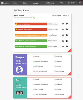
The Final Design
The final design for both Brooks and Sheila's design flow can be viewed in the clickable Invision prototype linked below. The flow will begin with Brooks and end with Sheila's. If you aren't sure where to click next, click anywhere on the page and a blue highlighted box will appear to indicate your next click. Click the button below to see the end product.