
My Spectrum App
.png)
Redesign of the Persistent Chat Feature in the My Spectrum App
Company: Charter Communications
Role: Lead Product Designer for Self-Install
Digital Products Team Background:
“Spectrum's Product and Technology team creates, develops, and operates the nation's fastest mobile service, most reliable internet service, most viewed live TV app, and the most advanced WiFi, serving nearly 100 million users and 500 million devices. We are transforming the next era of connectivity and entertainment experiences.” –Spectrum
Project Initiative:
The initial design for the persistent chat feature in the My Spectrum app risked frustrating customers and causing installation errors. The global persistent chat bubble was in a disruptive location and was going to be launched app-wide. After reviewing the proposal, I presented my audit to stakeholders demonstrating the issue and suggesting a redesign to create a seamless experience. My goal was to allow users to access chat without disrupting other tasks and crucial actions. This redesign aimed to prevent a spike in self-installation errors, which would otherwise lead to more customer service calls and increased costs for the company.
Project Overview
While working on the My Spectrum mobile app, I was the lead product designer for the guided self-install experience. I focused on creating a reliable and easy to understand experience for customers who are setting up or trouble shooting their Spectrum services at home.
At the point that the customer has entered the My Spectrum app for self-install they are at a delicate moment in their customer journey which requires a supportive and encouraging interface. Customers are relying on Spectrum to confidently lead them through their home set-up and troubleshooting process so that they can access necessary services they use daily. These services are crucial for work and leisure such as internet, home phone, and TV service.
When the digital support team approved a persistent chat assistant for the entire app, including the self-install experience, our team identified potential issues with the design. We saw risks of user confusion, errors, and reduced success rates, which could lead to more support calls and higher costs.
I conducted an audit to highlight these risks and led the analysis, proposing alternative designs to stakeholders.
The Design Audit
What design did stakeholders ask our team to implement?


The persistent chat feature is a "chat bubble" in the lower right hand corner of each screen. The feature requirement was that the chat bubble exist on each page of the My Spectrum app so that the user can theoretically ask for help on a topic at any point in the app and find it easily.
When the chat bubble is pressed, a chat messenger takes over the screen and can be exited and reentered at any point. The chat history will be saved and remain viewable if the user leaves and returns.

An even older version of the chat feature that existed prior to the "chat bubble" was a card on the support tab of the app. The customer would see this "Ask Spectrum" card available on the support page and have the opportunity to select "Launch Ask Spectrum". While the newer chat bubble design increased proximity to the feature for the user while they conduct their user journey, this "benefit" became a problem in itself.
Problem Statement
To begin the design process, I always empathize with the user by defining the existing or potential problem they are facing. I think about the feelings this problem causes and write it in my Figma file so that I can always guide and center my design decisions back to the core problem(s).
If the chat bubble design were implemented, the customer will face 3 main issues:
1. The chat button's location would hinder navigation
2. Its persistent presence and probability of mistakenly being selected during self-install could cause backend issues that increase the time it takes to complete their activation or create system errors that block their installation.
3. For screen reader users, the chat bubble would disrupt focus order and reduce screen space, especially for users on smaller devices or those with low vision who rely on enlarged fonts or magnification.
Problem #1: Distracting or Blocking Navigation
The self-installation user flows follow the same template across each piece of equipment the customer is setting up. Here I have demonstrated the placement of the "chat bubble" if it were implemented as is into the modem setup flow. The "chat bubble" is marked by the red circle on the screen.


As you can see, the "chat bubble" placement would exist in a location that could easily be tapped by accident by a user's thumb when using their mobile phone. The goal of our self-installation experience is to provide a distraction free experience for the user while they are completing a complicated task. The chat bubble location is distracting and can potentially navigate them away from an experience that already offers more assistance for self-installation than the chat feature is currently capable of.
Not only may the user click the chat by accident on the screens where it is partially blocking the 'next' button, but the customer may not be able to successfully move forward and click 'next' as the touch fields are intersecting.
This analysis leads us to our 1st user problem statement:
I am...
a Spectrum customer
I am trying to...
self-install my modem and router, Spectrum TV receiver, and/or home phone services
but...
I cannot proceed to the next screen in the set-up process
because...
there is a chat bubble blocking the "next" button on the screen that I keep clicking by mistake
which makes me feel...
frustrated and angry I can't complete the task I was instructed to do. Now I have to call customer service and wait on hold for help.
PROBLEM STATEMENT 1
Problem #2: Increase in Backend Errors
I met with my backend development team to outline each backend response to the customer opening the chat feature during connection or activation. This allowed us to clearly define which scenarios will cause an error and are a risk to the customer's success with self-installation. I have outlined each scenario and resulting backend behavior below:
Scenario 1:
If a customer is connecting or activating their equipment and they open the chat and the device connects or activates in the background while the user is chatting...then when customer closes chat, they have to restart the connection phase because the system needs to check for connection again.
Up to 12 minutes
Up to 2 minutes


Scenario 2:
If a customer is connecting or activating their equipment and they open the chat and the connection or activation is still in progress...then when the customer closes the chat, they will have to restart at the connection phase.
Up to 12 minutes
Up to 12 minutes

I am...
a Spectrum customer
I am trying to...
self-install my modem, router, Spectrum TV receiver, and/or home phone services and use the chat feature to ask questions
but...
my equipment has been trying to activate for more than 12 minutes
because...
(unknown to the customer, the backend is restarting their activation)
which makes me feel...
confused and worried that the app is stuck. I am upset that I've wasted my time trying to do this myself when I have to call anyways.
PROBLEM STATEMENT 2
In Summary:
If the customer opens the "Chat With Us" feature during connection or activation of their equipment, the chat will restart the timer for the connection/activation check on the backend. If the user happened to have a success occur in the background, they will need to wait an additional 2 minutes for a restart. If, their equipment had not connected and activated yet, it can add up to 12 minutes of wait time and could cause the user to think the app is frozen or stuck. This may spike abandonments and/or customer service calls.
Solutioning
My problem-solving process entailed many steps including:
1. a solo brainstorming session in Figma to collect my thoughts and draft first instinct ideas
2. competitive analysis of other large companies that use chat features in their apps and websites
3. discussion with my broader design team to find out if other designers have screens that will be negatively impacted by the placement of the chat bubble
4. collaboration with the accessibility teams and the design systems team to ensure my proposed design is accessible and feasible with the scale of our design system into the upcoming converged technology redesign project
5. review of my proposed solution with my broader design team, my self-install product team, and the self-install software engineers
6. writing a clear outline of each user problem the current chat bubble design causes and how my solution addresses each issue
7. anticipating solutions that stakeholders may propose, preparing a thoughtful consideration to the potential stakeholder ideas, and considering if my solution would address their concerns thoroughly
8. conducting a design review with my VP of design and the appropriate stakeholders on this project to present the final proposal
Competitive Analysis


My first instinct when problem-solving another location the chat feature could live was to put a chat icon in the header of the app.
Competitive analysis proves this is a common and expected pattern across many widely used applications including other telecomm companies such as Xfinity, T Mobile, and Verizon. My hypothesis is that users would expect to find in-app support within the header.
Accessibility and Design Systems: A Cross-Collaborative Approach to Solutioning
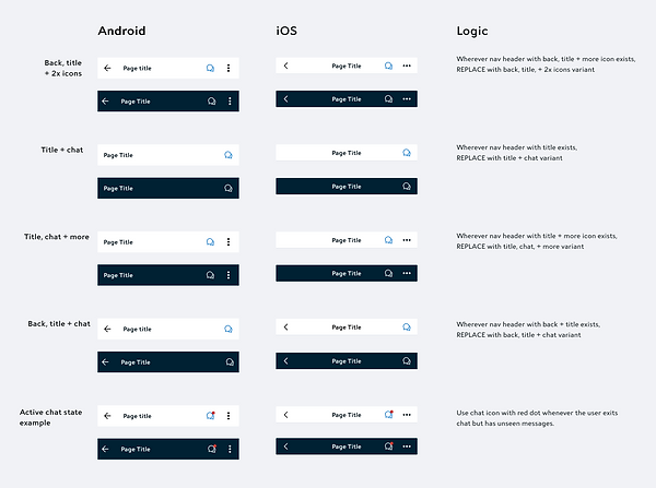
I designed an iteration of the chat icon in the header of the My Spectrum app and scheduled a design review with the accessibility and design systems teams. It was essential to ensure the design met accessibility standards and could be integrated into all existing header styles in time for the chat feature's launch. Although the self-install section uses multiple header styles, other areas of the app have even more, so my design needed to be scalable and work across the entire app as a global solution.


Accessibility:
The accessibility team's official recommendation was in support of placing the chat icon in the header. They agreed it’s beneficial because it’s a common, consistent location that users expect, reducing annoyance. This design is also accessible, while the other was not. It supports screen reader functionality and preserving screen space for low-vision users.
The accessibility team worked with the design systems and development teams to refine size, color, header title length, and screen reader behavior, ensuring the new chat implementation met accessibility standards.
Design Systems:
The design systems team and I reviewed all header styles within the app, identifying high-risk headers—those with long page titles and three icons—that required immediate adjustments to integrate the chat icon without significant redesigns.
My initiation of the chat feature redesign kicked off a component audit, resulting in a more consistent design system across the app. Page titles were shortened to accommodate the chat icon, simplifying and standardizing naming conventions throughout the app.
The Stakeholder Meeting
The Design Team Recommendation:
With the final design iteration prepared, vetted as accessible, and verified possible by the design systems team, I presented my version of the chat feature as the official recommendation to stakeholders.
Keeping in mind that redesigning the chat feature will cost some time and money, my goal is to propose the solution with the lowest level of effort and the most value to be gained. I supported my recommendation with the following points:
Problem 1: the user cannot navigate the app when the chat bubble is blocking their actions which will interrupt their self-installation and require them to call customer service for help. With an average of 150,000 self-install customers per month, if each of them cannot proceed in the self-installation flow and need to call customer service that would cost the company $1,650,000 per month at $11 per call.
Anticipated stakeholder response: what if we move the chat bubble on screens which it is blocking important actions?
Design recommendation: I recommend that instead of a floating chat bubble, we create a chat icon which can live consistently in the header of the app. This will...
-
follow design pattern norms and norms of other telecomm companies who have a support chat
-
still provide a consistent and findable location so that customers can chat any time they need
-
be accessible
-
save development and design time, effort, and maintenance by integrating the chat into a component which has variations built in and can easily be consumed "out of the box" by software developers
I do not recommend moving the chat bubble's position on screens as needed because this will be a time consuming design and development process. It would create different specs for many screens throughout the app and would be more work to maintain from a development standpoint than a global pattern. The positioning of the chat bubble not only blocks many of the screens within self-installation but also in other areas of the app. It would also be an inconsistent location for the customer to find the chat bubble in different quadrants of the screen, would look unorganized to the customer and give a poor impression, and does not solve for the issue of accessibility.
Problem 2: If the customer opens the "Chat With Us" feature during connection or activation of their equipment, the chat will restart the timer for the connection/activation check on the backend. Depending on the status of their equipment during the chat, the user will have to wait an additional 2 to 12 minutes for the backend to re-check their equipment once the chat is exited. This additional wait time could cause the user to think the app is frozen or stuck and may spike abandonments and/or customer service calls.
Design recommendation: To keep users focused and improve the chances of a successful activation, I recommend disabling the chat function during the connection and activation screens. The step-by-step self-install process already provides real-time troubleshooting, so chat adds no value at this stage and only risks causing interruptions or errors. Similar to the absence of a back arrow on these screens, removing the chat icon from the header during these phases is a simple solution to help users stay on task.